How a Hero moment increased the recommended product selection by 70%

The Problem
Picking the right health plan
is still HARD.
Even with an easier UI and fewer barriers to explore plans compared to government sites, we found people continued to lack confidence when selecting a plan.
Stride's mission as a business is to take as much complexity out of being an independent worker as possible, so addressing this user frustration was and continues to be a critical goal for the company to deliver quality experiences.
I dread [buying health insurance]. You only get once chance a year to make a choice and if you chose wrong, you're stuck with the consequences.
-User Interview, December 2023
The Impact
The "Hero" moment launched March 2024. Here's what we learned:
The current "All Plans" page is overwhelming.
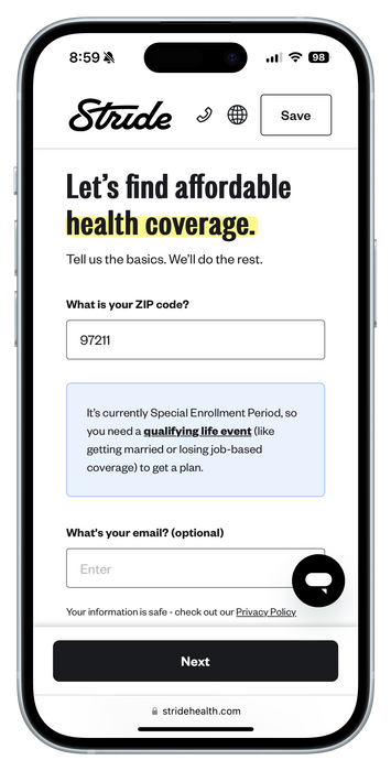
After 4 questions, people land on the All Plans page, which lists sometimes over 100 insurance plans.
This should be the moment of reward where their effort pays off.
"I don't understand 'deductible'."
Stride users are on a spectrum of health insurance term understanding. Not understanding critical terminology eroded confidence and contributed to users giving up their search.
We should frame copy in ways most people
understand.
Don't ask questions too early.
We have optional questions to provide a more accurate recommendation prior to seeing plans-–medications, preferred doctors, and health conditions––but people did not perceive this as optional and were annoyed––"Just let me see my options already!"

A new page with progressive disclosure to create focus and calm.
-
Reduced visual noise compared to seeing 100+ plans first
-
Progressive disclosure ensures the amount of content on the screen is in the user's control
Exploration
A hero is born.
After analyzing interviews and business needs, we decided to create a new page that highlights a single recommended plan. We sketched out several iterations and landed on the MVP designs, below.
Stride helps 1099 workers navigate the complexities of being independent, providing software tools for finding the right health, dental, and vision insurance plans, for tracking finances, and planning for taxes.
In early 2024, we found our users were struggling to feel confident when picking a health insurance plan. We created a "Hero" moment where we recommended a single insurance plan, curated specifically for the individual and their health needs. As a result, we saw an increase of 70% of users selecting the recommended plan and increased confidence after picking their plan.
Background
Stride's health insurance shopping funnel helps people find plans.
People choose to use Stride's health insurance shopping flow because it's easier than the federal and state-based marketplace health shopping flows. Most government sites bury plan options behind long forms and walls of text. Stride allows users to browse plans after answering only a few relevant questions.
My Role
Senior Product Designer, Competitive Analysis, UX/UI Design, Prototyping, User Testing, Requirement Writing
Team
Product Design Lead (me), PM, Engineers
Timeframe
2 months
Discovery
I recruited and interviewed people to better understand the problem.

To dive deeper into how we might increase confidence with picking health plans, I conducted research interviews. Here were the top insights:
70.1% increase
People selected the recommended plan more than before.
4/5 reported feeling more confident with their selected plan.
During post-launch interviews, people responded positively to the simplified copy, saying the explanation helped provide clarity.
Overall conversion increased slightly.
We had hoped this change would have a big impact on overall conversion, but found it stayed mostly flat.
90% of people left the page.
Unsurprisingly, people still need to compare their recommended plan to other plans to build confidence. Most left the "Recommended" page to view the "All Plans" page and rarely returned to the original "Hero" page.
We made improvements in subsequent iterations, like better support for comparing the recommended plan to other plans in a single view, animation, illustration, loading interstitials, and general copy tweaks.
Overall, we were successful in increasing confidence but had more work to do to increase our overall conversion goal.
-
Answer the most important questions first: how much do I have to pay, and what happens if I get into an accident
An easy-to-understand breakdown explaining why this plan is recommended for this specific person's situation
-
Provide clear feedback on the important stuff: coverage of their meds and their doctors


